Thursday, February 9, 2012

Of portraits and figures

Here is something I thought I would never do and that is paint a portrait and/or figure.  Not because I dislike people, but because I didn't think I would be able to do it.  I still don't know if I will be able to do it but now I hope so.  Believe it or not, the two paintings are of the same girl.  My class did the full body painting one week and then the portrait the next.  According to my wife, the poor girl looks like a long haired man holding a knife in the full body painting.  I can't say I disagree with her.

I am somewhat happy with the portrait painting so far.  I also enjoyed doing it.  I am still struggling with getting the three dimensional look but I think I am a lot closer with this portrait.  I mixed up three shades of the skin tone to represent the highlights, mid-tones and shadow.  From a few feet back she actually looks somewhat 3D.  I will work on it in the coming weeks using reference photos I took at the end of the class.  I hope I can really learn to do a decent portrait.

I learned that in painting, just like photography, that lighting is key.  We had horrible overhead fluorescent lighting that really gave very little modeling to the girl.  I can see when doing portraits or a still life or anything really, that lighting is very important.  I knew that it was for photography but it is just as important to painting and for the same reasons.  It is the light we are trying to capture after all.


Thursday, February 2, 2012

The color matrix - final update

I finally finished the warm color matrix last night. I finished the shades for the tertiary colors. This has been quite the exercise but it has been well worth it. Now I have some idea how to get the color I want. This matrix provides 84 different colors, shades and tints but there are still lots of colors this matrix doesn't cover. For now this gives me a good start. I will, at some point in the future, do this again for the cool colors.

When I do this again, I will start off more slowly on the tints. There is a big difference between the pure color and the first tint which was done at a 1:1 mix of the pure color and Titanium white. Next time I will start with a 2:1 ratio of the pure color to titanium white. The shades don't use the ratio I marked along the side. When you start shading (darkening) a color, it darkens quickly. It doesn't take much of the complementary color to really darken a color so it is best to add just a very little bit, mix it up and then add more if needed. Just like the saying goes in carpentry, measure twice and cut once, in paint mixing, start light and work toward darker. Once you darken it, you can't lighten it again. Well, technically you can because you can add more of the original color you are trying to darken but it will take a lot of that color to lighten it again.

The warm color matrix

Monday, January 30, 2012

The color matrix part 3, creating shades

I am halfway finished with creating shades of the colors.  I have the primary and secondary colors done.  I relearned that colors darken quickly.  It takes very little of the complementary color to darken a color.  I wasn't sure I would like the shades as well as I liked the tints but I do.  The red tinted down to a nice, deep red.  The blue turned a nice blue grey.  The yellow and green was beautiful as well.  Most of the colors start heading toward a shade of brown but the blue I think will darken toward black.

I have one more session to go to finish the tertiary colors and I will be done with the tints and shades of the warm color palette.  I really need to do this same exercise for the cool color palette but I think it is time I get back to real painting.  I will come back to the cool palette eventually.

Primary and secondary color shades

Sunday, January 29, 2012

Trying my hand at making blacks and greys

After doing a color wheel and a color matrix, it was now time to try my hand at black and shades of grey.  I started with an even mix of Prussian Blue and orange made from an even mix Cadmium Yellow and Alizarin Crimson.  It looks very black on the canvas.  I then added more and more white to get shades of grey.  It turned into a beautiful battleship grey which had a very slight blue tint to it.

The bottom row of colors are where I mixed Cadmium Yellow Light, Cadmium Red Medium and Cadmium Red Light with different shades of the grey paint.  The mix with the yellow turned green so you can definitely tell that it was a blue-grey paint mixture.  It created colors that I didn't have matches for on my previous exercise of creating tints.

Black & Grey Shades

Saturday, January 28, 2012

The color matrix part 2

I finished up the tints of the tertiary colors today.  Just like with the secondary colors, I really like the oranges and greens in the tertiary colors.  Next up is to do the shades.  I may take a break before tackling those.

I have two pallets full of leftover paint so I am thinking about trying to paint something with them.  Maybe some kind of flowers?  I am anxious to try out the various shades and see how they work together.


Orange and green before mixing

Orange and green after mixing

Red before mixing

Red after mixing

Final tints

Thursday, January 26, 2012

The art of the color matrix

I am back at the color wheel today, though this is not a wheel.  I thought about calling it the color square except that it is a rectangle.  Somehow color rectangle doesn't roll off the tongue very well so I call it the color matrix.  I got the idea from doing the color wheel and seeing the color recipes in various color mixing books.  It occurred to me after doing the color wheel that I am trying to paint and I don't even know what to expect when I start mixing colors.  Sure, you can read books like the Color Mixing Bible I mentioned in a prior post but there is nothing like doing it yourself.

So I decided to lay the color wheel out in a line and mix tints and shades to see how the colors react.  In case you don't know, a shade is when you darken the color and a tint is when you lighten it.  About the only way to lighten a color, as far as I know, is to add white.  For shading, you can add black but I have read in multiple places that black paint mixed with other colors leads to dead looking colors.  It seems the generally accepted way to darken a color is to add a little of its complement.

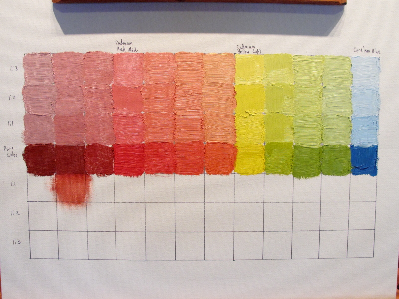
So now I had decided to do various levels of tints and shades so next up was to lay it out on a canvas board.  I created a grid of 1" squares in a 7x12 matrix on an 11x14 canvas board.  I used a T-square to be fairly precise with the layout.  I put the pure color in the middle row of the 7 rows and that left room for 3 levels of tints in the top 3 rows and 3 levels of shades in the bottom 3 rows.  So the end result will be the lightest shade on the top row and getting progressively darker down to the bottom row.  I then had to decide which column to put the colors into.  I decided to start on the left with the red hue of the color wheel and start to the right as I move clockwise around the color wheel so that the blue ends up in the far right column. I also started with the warm colors first with Cadmium Yellow Light, Cadmium Red Medium and Cerulean Blue as my primary colors.

Blank color matrix

Warm color palette

Now that I knew what I wanted to do, I had to figure out how to do it.  I grabbed a piece of palette paper and squeezed out a little of each of the 3 primary colors in a 4x3 grid on the paper.  I then added a little white next to the appropriate piles of color, starting with a little white on the 2nd row from the bottom and increasing the amount of white as I moved up rows.  The bottom row was the pure color.  The way I laid out the palette matched the way it was going to go onto the canvas board.  I went with a ratio of 1:1 for the pure color and white to start.  Then I went to a ratio of 1:2 where I had twice the white paint as the pure color.  The final ratio was 1:3.  If I ever do this again, I might use the following ratios, 2:1, 1:1, 1:2 as the colors lightened up quickly and the resulting colors were only slightly lighter than the next.


Palette before mixing

Palette after mixing

Now it was time to put the brush to canvas.  I started with the pure colors and worked my way up to match the matrix I had laid out.  I wiped the brush as clean as possible before doing each color swatch to avoid contaminating the patches of color.  The result showed subtle differences between each tint.  That shows how many variations you can create by just slowly adding more and more white.  As I mentioned above, I wish I had not started with such a strong mix for the first swatch to maybe see a little more variation.  A note about the red column is that it turns pink in a hurry when you start adding white.  The yellow and blue made beautiful tints.

The primary colors

Now that the primary colors are complete, next up was the secondary colors.  This time the mixing was a little more involved.  I added the primary colors evenly (1:1) and then added the white.  I had to use more white this time since I had twice the amount of color in each swatch.

I was anxious to see the tints of the secondary colors and they did not disappoint.  The secondary colors were beautiful, well except for the reds.  Not that the reds were ugly, but the greens and oranges were spectacular.

Ready to mix the secondary colors

The secondary colors

The primary and secondary colors

The next phase of this exercise is to create the tints for the tertiary colors.  I am anxious to see those as well. Once the tints are done it will be time to do the shades.  I am not sure how those will turn out so I am looking forward to that exercise.  As I mentioned earlier, shades should be made by adding the complementary color so there will be a lot of mixing involved in creating the shades as I will have to vary the amount of the complementary color to add.

The final part of this exercise is to do the same matrix for the cool colors.  I am sure this will be quite a tedious chore by then but it should be well worth it.  After all, how can you sit down and paint when you don't even know how the color will react to the mixes?


Saturday, January 21, 2012

The art of the color wheel

I decided since I can't seem to paint much else that I would try my hand at a color wheel. Two color wheels actually. The book "Color Mixing Bible" recommends doing a warm and a cool version so that is what I did. I traced two circles on an 11x14 canvas board and sectioned them off. The primary colors on the warm side are Cadmium Red Medium, Cadmium Yellow Light and Cerulean Blue. The primary colors on the cool side are Permanent Alizarin Crimson, Cadmium Yellow Medium and Prussian Blue.

I absolutely love the warm colors. The colors are beautiful. I expected the blue and red to create a violet color but instead it created a deep, brick red color. I have read that many artists keep a tube of purple paint with them because it is hard to mix your own and I see that I may have to do the same.

Along with the warm color wheel, I really like the right half of the cool color wheel. The colors are deep and rich. I found out that the cool blue over powers the other colors very quickly though. The blue section near the Alizarin Crimson has twice as much red as it does blue and you have too look very hard to see any difference. Reflected light is subtractive in nature, that is, the more color you mix the darker it gets, and this proves that out nicely. Now the cool yellow mixed with the cool blue very nicely creating subtle shades of dark green.

The next exercise I need to do is try mixing the warm colors with the cool colors and see what I get. One tip I saw on YouTube said not to do that because the colors end up looking muddy, but there is no better way to find out than to try it myself. Yet another exercise to try is to create shades of grey. I think I can tint a mix of Alizarin Crimson and Prussian blue with white to get shades of grey. The final exercise is to create color patches varying the amount of each color mixed to get even more shades of the colors.

This was a very worthwhile exercise and I recommend every new painter try it along with the other exercises I mentioned.

The photo doesn't fully translate the results

A look at my palette

Here is a look at my palette. This was recommended by my instructor and from my research on the internet it appears to be pretty standard. Going from left to right the paints are:
  • Titanium White
  • Cadmium Yellow Light
  • Cadmium Yellow Medium
  • Cadmium Red Medium
  • Permanent Alizarin Crimson
  • Cerulean Blue
  • French Ultramarine
  • Prussian Blue
  • Burnt Umber


I am not entirely happy with the plexiglass palette. I have some stress cracks in it from pushing down on it while holding it to clean. It is also tough to tell how the color will look on the clear palette. You can see through it or you get reflections off of it. It does clean up easily though. I will most likely get a wooden palette after I learn more about painting.

Friday, January 20, 2012

Arghhh! I am going backwards

My painting skills, what little there are of them, are going backwards. I can't seem to get anything figured out. My latest painting, which is an attempt at a rework of my last painting, is terrible. The colors are flat and lifeless and the perspective is better but still off. I started with a wash of the canvas in a thinned out burnt umber. Then I drew in the major details, especially the barn, and then started painting. I honestly don't know what I am doing wrong. I will have a lot of questions for the instructor of my painting class next week. I plan to keep working on the painting but at this point I don't think it is salvageable.

Tuesday, January 17, 2012

Two classes down, six more to go

I finished up my second of eight classes last night.  I hate to count them down as it appears that I am anxious for them to end. That is not the case as I will be sad when they are over.  I am enjoying the class even though I took a step backwards in my painting last night.  I took in a photo that I had taken back in December.  As you can see below, the perspective of the barn is way off.  I have effectively flattened the barn.  Before I start again,   I am going to practice sketching it to get the perspective right.

Another problem is the color.  My colors are too bold.  This is an old, faded barn and I want to reflect that in the painting.  The shadows are too bright as well.  The shadows in the photo are much deeper and I need to capture that to really get the 3D effect and lighting effects.

One other problem, and definitely not the last, is my painting shows the barn to prominently.  I am titling this "Hidden Barn" since the view of the barn is through the brush and the barn is engulfed in trees and undergrowth.  My painting does not give that same sense of seclusion.

Painting from a photo

Photo of a barn

I am going to keep working on the painting I started, but the background won't be dry for a while so I am going to make a second attempt from scratch.  I did my first wash of a canvas (a canvas board in this case) tonight that I am letting dry.  My hope is that I can lay in the background trees when I start again so that I don't have to wait.

I am not sure if you are suppose to do a wash on a canvas board; I guess I should have researched that first.  Oh well, I will find out soon enough.

Canvas board with a wash of thinned down burnt umber

Sunday, January 15, 2012

Things I have learned so far

I want to do a quick post to cover the things I have learned so far.  These are all things an experienced painter will take for granted but newbies like me must learn by doing.

  1. Don't over mix the paint - Don't mix paints so thoroughly that they make a solid, uniform color.  Leave them partially unmixed to get the subtle shading, depth and character to your subject.  If mixed to thoroughly, the painting becomes flat and lifeless.
  2. Don't mix different temperature paints together - What I mean by this is if you are trying to mix a green by using a yellow and a blue, use both warm colors or cool colors.  Don't mix a warm blue with a cool green or vice versa.  The result is a muddy color rather than a vibrant one.
  3. Don't be afraid to see the brush strokes.  This is probably more of a personal preference than a general rule.  But to me, coming from a photography background, I want to see the brush strokes.  I want to know it is a painting and not a photograph.
  4. Use a generous amount of thinner to clean the brush.  I started with just a little thinner to be conservative but I quickly dirtied the thinner by cleaning the brush which then started contaminating my colors.
  5. Use a complementary color to darken a color, especially for shadows.  This is basic color theory but after you see it for yourself you realize how well it works.
  6. Don't mix too many colors or the result will be a muddy brown.  I found this out quickly.  By the time you mix a few colors together the paint becomes brown.  This is due to the subtractive nature of reflected light.   The more colors you mix, the darker the result.
  7. Don't over work the painting or it will become flat and lifeless.
  8. Add a small amount of a dark color to the lighter color to darken the lighter color.  If you use even amounts of both, you end up with the secondary color or even a brown color depending on the paints being mixed.  It takes very little of the darker color to darken the lighter color so start slowly.
  9. Don't mash down on the brush when you paint.  Use the last one third of the tip of the bristles.  When you mash down you push out other colors from the bristles that contaminate the color you are currently using.  I got this tip from Daniel Edmondson's YouTube channel.
  10. Pay close attention to what you do that works and especially what doesn't work.  When you end up with a result that you like or don't like, take a minute to examine how you arrived at that spot.  This way you can repeat the things the work and learn from the things that don't.  I learned the above items by actually doing them even though I had read about them or watched them in videos on YouTube.  So even though I may know it before I do it, doing it is the best way to actually learn it and let it sink in.  There is nothing like actually mixing paint on a pallet or putting paint on a canvas.

Saturday, January 14, 2012

Here is my second painting

Just finished my second oil painting ever and while it isn't great, I am happier with it compared to my first effort.  I tried to use some of the lessons from my first attempt with varied success.  I quickly realized, again, that it takes very little of a darker color to darken the mix.  It is best to add in very little of the darker paint at a time.

I also mixed the paint less thoroughly to try to get some variation in the color.  In my first attempt, the colors were too even, too uniform.  They resulted in just a mass of lifeless solid color.  This time I have some variation in the shading.  The fruit also looks more like fruit.  They looked liked colored balls in the first painting instead of an apple and an orange.

I am still struggling with getting a three dimensional look.  I think I did pretty good on the shadows on the table, but the fruit could be better.  The jug could definitely be better.  My next class is this Monday so I will definitely have some questions for the instructor.

One final observations is it seems to be ok to pick up some of the neighboring color when painting the edges of the objects.  It softens the edges and, too me, maybe gives it a little more three dimensional look.


Tuesday, January 10, 2012

Here is my very first oil painting

Here comes the scary part, sharing my painting.  I made multiple mistakes on this first attempt, as you would expect for a first try.  I mixed some of the colors too thoroughly so they ended up as solid blobs of color with no life.  I also found it hard to mix the paint.  Just a little bit of some colors caused the mix to be very dark and I was forever trying to lighten it.  I will most likely start from scratch on a canvas panel this weekend and try this again.  I hope that my second effort will end with better results.

This is what the painting looked like after the class:

This is what the painting looked like after my feeble attempt to add some dimension:

One class down, seven more to go

I had my first oil painting class last night and now I am more worried than ever.  The first class went exactly as I expected.  We covered some color theory, paint mixing and drawing techniques.  Turns out, as I suspected, drawing is an important part of painting.  But the style I plan to learn, impressionism, should not require the precision more realistic styles do.

We did get a chance to put some paint on a canvas.  The instructor set up a still life of the usual vase and fruit.  He painted first and then it was our turn.  Wow, is it harder than it looks.  First off, paint mixing is an art in itself.  I found it hard to grab two paints to mix without contaminating each paint with the other paint.  We only used brushes to mix the paint so I need to clean it before dabbing a second color.  The alternative is to use a pallet knife that can be easily wiped clean.  I will try the knife on my own this week.

The next problem is knowing what paints to mix and in what proportion to achieve the desired color.  This will come with practice.  It does seem that to get the color you want you should start with the lightest color and slowly add in the darker color until you achieve the hue and value you desire.  See I am already using the lingo.

Finally, putting the paint on canvas is tough too.  I ended up with solid masses of color where subtle shading and variation would be preferred.   My homework is to finish the painting before the next class so that will give me a chance to give the scene some dimension.

I had a great time and I am looking forward to the doing my homework and the next class. 

Sunday, January 8, 2012

Drawing is going to be quite the challenge


I have been really worried about learning to paint ever since I discovered that I need to learn to draw too.  I don't draw.  I am not even a doodler.  Sure, I drew as a kid, but who didn't?  After doing some of the exercises from the drawing book I mentioned in my last post I am even more worried.  On the surface drawing doesn't seem like it should be too hard.  After all, you only have to be able to draw straight or curved lines, everything else builds on that.  But I am not good at either.

One technique I figured out, I think, is you have to move your whole arm when drawing.  I was mostly moving my hand at the wrist and straight lines weren't straight and circles were oblong.  But I am following some blogs by other artists and watching videos on YouTube and a couple times I saw it mentioned that you move your whole arm when making brush strokes.  So it occurred to me that if that works for painting then maybe it works for drawing.  I gave it a shot and it works for drawing as well.

So if that is the case, why didn't the book tell me that?  So I went back over what I had read and there is a page with some text on several techniques for drawing.  There was one mention of moving your whole arm.  I feel if this is really how you are suppose to draw, then there should have been more emphasis on that one point.  So I am still wondering if I am on to something or not.  If anyone knows the answer please speak up as it would help me immensely.

Wednesday, January 4, 2012

Notes about a couple books I am reading


As I have mentioned, when I take an interest in something I dive in and study it like mad.  I already have several books, thanks to my dad, on drawing and painting.  The first book is the "Color Mixing Bible" by Ian Sidaway.  I really, really like this book.  While most of it has color recipes for every concievable medium such as oils, acrylics, watercolors and soft pastels, it has a lot of color theory.  The first part of the book covers color theory, color mixing and so on.  It is a very quick, easy read and most of all informative.

Next up I have a book on drawing titled "Drawing for the Absolute Beginner" by Mark and Mary Willenbrink.  I am only part way into the book but so far I like it.  It is done in a similar manner to the Color Mixing Bible as it has short, to the point text and lots of examples.  Drawing scares me though.  I did not think about having to draw to be a good painter.  I see now that drawing will be very important to painting.  Even if you paint from scratch without an under drawing, the principles of drawing still apply.  So I have much to learn and much practicing to do.

Monday, January 2, 2012

What type of painter will I be?


I haven't even put the first stroke of paint on a canvas and I already know what kind of painting I want to do.  I told you I was OCD about learning a new subject didn't I?  I want to be an impressionist painter and use a palette knife instead of a brush.

Why impressionism?  Mostly because that is what I like, but partly because that may be all I can do.  I can barely sign my name legibly so I  don't think I will have the fine motor skill to do realistic painting.  While I admire realistic painters and the skill it must take to do that, I want a painting to look like a painting.  I want to see the texture and the brush strokes.  So for lack of fine motor skill and personal preferences, impressionism it is.

I also want to learn to use the palette knife and lay the paint on thick.  As I said, I want texture and what better way to achieve that than with a palette knife and thick layers of paint?  I do want to learn to use the brush and will do a lot of  paintings with the brush, but in the long run I want to use the knife.  It just seems like that paintings done with a knife have a life to them that flat paintings just don't have.

Since I already know the style and technique of painting I want to do I should be painting masterpieces in no time, right?

Sunday, January 1, 2012

Day one of my journey to becoming an oil painter

It is the start of another year.  New Years is a time to reflect on the past and look to the future.  I don't focus too much on the past as there isn't much I can do about it.  I don't look forward nearly as much as I should either.  But one thing I am looking forward to is my first oil painting class.  I am smack in the middle of mid-life, at least I hope I have as much life left in front of me as I have had behind me, and it is time to get artsy.

This won't be my first attempt to be artsy as I spent about 20 years doing photography as a hobby.  I greatly enjoyed it but almost 2 years ago I sold all of my equipment except for a decent point-and-shoot digital camera.  I wasn't using it as much as I needed to and I was never fully satisfied with my results.  Part of it was the equipment but if I am being honest with myself, and who likes to do that, most of it was me.  Oh sure, I studied, read, worked examples, etc, but I don't know that I really have the eye.  I could get well exposed shots, used the rule of thirds and so on, but came away with far too few really good shots.  I occasionally got lucky and got a wall hanger, but it wasn't often enough.  I also didn't get out at the right times in the right light.  Since photography was only a hobby, I had to work around my job and all the other things in life that get in the way of what you really want to do.  My wife was very patient with my hobby but I couldn't ask her to get up before daylight on vacation to catch the magic hour of light.  Plus you don't always get the weather and lighting when you are out.  It is because of this that I have always envied painters.  If the scene isn't to their liking, they can make it whatever they want.  They can turn grey skies into blue, remove power lines and add elements when needed.

So with that in mind, my wife got tired of me talking about learning to paint and gave me an oil painting class for Christmas.  Of course now I have spent more on the supplies than I spent on the cost of the class.  But I am anxious to put some paint on a canvas.  So I am approaching oil painting like I did photography and most other things, I am diving in head first.  I have been reading blogs, watching YouTube videos and reading how-to articles and a couple books.  I am a little OCD when it comes to learning new things.  I will research the subject to death until I have squeezed every last drop of knowlege out of it.  As  nice as it is to learn this way it can also be a drawback because I learn what is out there, what is possible and if I can't obtain those same results I may get discouraged.  From my initial studying I see I have a lot to learn.  I am not going to paint a masterpiece anytime soon if ever.  But I think I am fine with that.  I am just hoping I can put some art on the wall that I am proud of.

I hope that my background in photography will help me examine lighting, perspective and the many other facets of painting that overlap with photography.  As mentioned above, I hope to be able to paint a scene as I want to see it and not as it actually is.  This is the problem with photography I hope to solve with painting.

This blog will document my journey from photography to oil painting.  Feel free to comment on my posts as I will accept any tips, tricks, techniques and critiques you have to offer.